
5 chatbot UI examples of user interface design
Understand key elements of chatbot UI design, learn about best practices, design tools, and evaluation methods, and get inspired by top chatbot design examples.
Chatbots are very popular nowadays and their application is wide and immersive. They help doctors, lawyers, teachers, and, of course, businesses. Chatbot platforms are transforming the way humans interact with machines, affecting brands and their target audiences.
One of the most important parts to pay attention to while building a chatbot is chatbot UI and chatbot UX design—statistics say 8 out of 10 people would continue using a chatbot if they had a pleasant experience. Well-designed chatbot user interfaces improve users’ engagement and increase the overall chatbot effectiveness.
What is a chatbot UI
Chatbot interface is the visual part of the bot. Simply put, it’s the interface that enables users to interact with the bot. No matter how powerful AI technology is driving the chatbot, if it lacks appealing visual representation, its performance will be low. Great chatbot interface design is vital, that's why it’s worth discussing in more detail.
Chatbot UI key elements
Communication with the chatbot takes place in a conversational chat window. It should feature:
Chatbot picture. One of the elements of the chatbot user interface is an avatar. Visual representation is more personalized and engaging.
Chatbot status/custom tagline. Another important thing for chat bot UI is the indicator of the availability: offline, busy, or available.
Chatbot name. Naming is essential. To have a good impression on users, it’s better to provide a name to your bot.
Chatbot messaging. Other than text or voice commands it’s worth training AI to produce images and GIFs to interact with users.
Chatbot settings: Providing a chatbot interface with the ability to customize it and adjust for users’ needs is another good point in getting closer to users’ hearts.
Welcome message. Chatbot UI benefits from an engaging welcome message. Make it informative and friendly.
Error handling. The UI for the chatbot should be error-resistant. Any misunderstanding that might take place requires a graceful reply from the chatbot.
Chatbot UI design best practices
- Provide easy and simple navigation
Intuit navigation through the chatbot interface is vital to make it appealing to users. Try to avoid cluttering unnecessary elements that could be confusing.
- Personalize your chatbot UI design
While creating chatbot responses mind the language and the tone of voice, which should be ideal to reflect your brand values. Keep in mind user preferences as well.
- Make the chatbot user interface visually consistent
To make a chatbot engaging and more interactive it’s a good idea to incorporate various visual elements: images, reply buttons, emoji, and GIFs. etc. Also, it’s important to bring consistency of good chatbot UI design and the overall company or website design.
Chatbot UI design tools and frameworks
Figma
Figma is a well-known and widely used UI design software. It helps to create an engaging and interactive UI for chatbots. Figma opens the opportunity for collaboration, with extensive third-party plugin support and various integrations.
Sketch
Sketch is another tool for effective chatbot UI design that is extremely resourceful in text and layer styles, as well as symbol libraries. It can be used by several designers simultaneously with the only disadvantage — it’s available on macOS only.
InVision
InVision is a tool for creating chatbot user interface UI that provides chatbot UI designers with the required functionality to build wireframes and chatbot prototypes. It facilitates the chatbot interface design process and can be used collaboratively.
Methods for evaluating chatbot UI effectiveness
There are several ways to evaluate user interface engagement:
User feedback. To understand user expectations and challenges, as well as satisfaction levels, consider running questionnaires and surveys. Though this data is self-reported, it can add to the overall understanding of how effective chatbot UI is.
Heuristic evaluation. This method helps identify potential issues with the chatbot UI in the early stages of its development. Analyzing chatbot UI against the established set of usability principles is important and cost-effective.
Eye-tracking. This is a very valuable method of assessment though one of the most expensive ones. It helps to track users' reactions to visual elements and UI design.
5 chatbot design examples
- Chatfuel
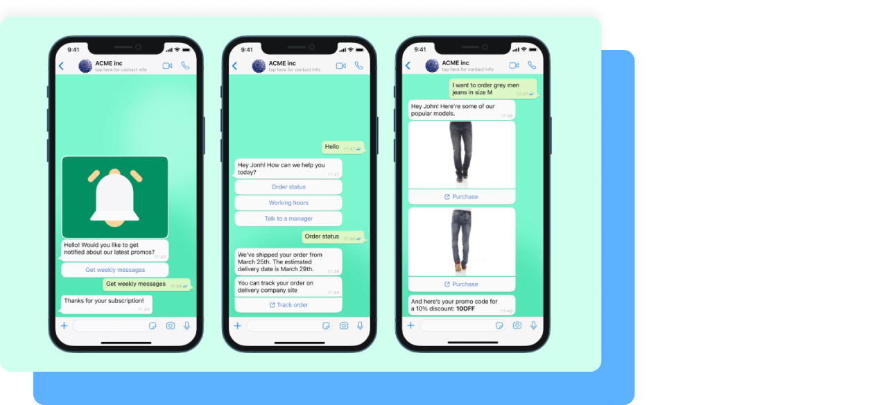
Chatfuel is a no-code bot-building platform. From simple chatbots for customer service to smart and powerful AI agents, Chatfuel's solution interfaces are perfectly calibrated. Besides flawless UI, bots built with Chatfuel integrate with third-party software such as Shopify, Stripe, Calendly, Zapier, and others. It means your bot can not only answer FAQs and handle basic tasks, but also accept payments right in the chat, schedule appointments, qualify leads, and more. With Chatfuel, you can build bots for WhatsApp, Facebook Messenger, Instagram, and your website.
Claim your free trial to see how Chatfuel can simplify communication with your customers and prospects.
- Replika

Replika is an innovative chatbot that learns from users’ conversations and even mirrors their conversational styles. It adapts the tone and the mood according to the subject matter. Another feature is that the chatbot UI is highly customizable up to the level that a user can give it a name or change interface visual elements. Additionally, this live chat has a unique feature where it acknowledges and rewards users for their positive behaviors and accomplishments by granting them badges.
- Lark
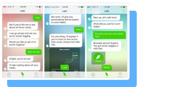
Lark is a healthcare chatbot aimed at seniors. It is programmed to reply in a kind, friendly, and engaging way to be appealing to users. This chatbot UI and style of conversation make it very humanlike with elements of behavioral coaching for seniors to be more responsible about their health. Also, Lark’s chatbot UI is user-centric and no extra help is required for seniors to operate it.
- Erica

Erica the chatbot created for banking counseling advice. Erica’s chat UI design is user-friendly, it includes an ideal balance of images, text, and graphs discussing the user's personal finances. Also, it can be both chat- and voice-driven. The chatbot features the FAQ section and is resourceful in providing feedback to users’ requests in an authoritative yet trustworthy way: praise and emoji.
- Milo
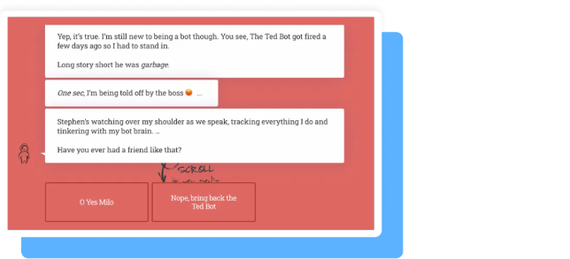
Milo is a chatbot helping to build websites. It’s located on Artful Science’s page and provides a joyful journey for its users on the way to building their websites. Though Milo’s customization opportunities are quite limited, the way the chat interacts with users is friendly and lovable. Images and GIFs are often used by Milo to strengthen the personalized attitude. Milo is an ideal solution to greet newcomers to your website and programmed appropriately, it will show them around.
Summary
It’s important to make sure that your company is represented through a resilient yet visually engaging copilot or a bot with an appealing chatbot interface design. Such an asset can increase users’ engagement, create more personalized user experiences, and deliver value to your brand. Not to mention handling many user requests at the same time and being capable of accomplishing tasks of various difficulty levels.
